21 Mar
How to build a colour scheme from a pattern

Interiors expert Joanna Thornhill explains why a pattern-first approach can offer a fool-proof way to create a cohesive scheme.
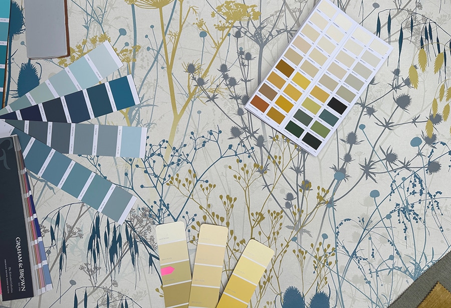
Most people will have some idea of what colours and materials they would like to use in a scheme, and this can be a helpful start. I would suggest ordering lots of samples and swatches in those tones, and using those as the cornerstones for your decorating. Don’t forget paint can be mixed to match any colour you can dream of!
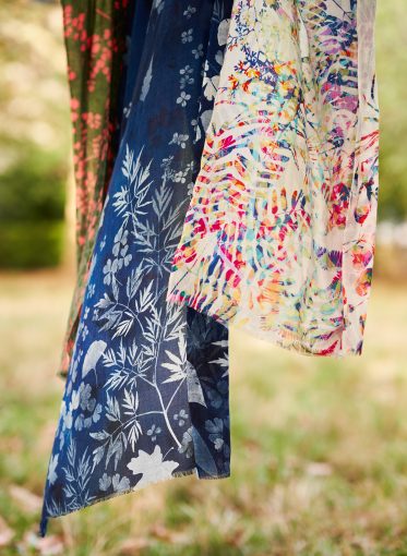
If you’re debating which print to lead with in your scheme (or mulling over which colourway, or how best to use it) consider the pattern itself: is it a busy design full of lots of clashing colours and motifs, or is it more muted and subtle? And what kind of look are you hoping for? Bold maximalism or subtle patterns and textures?
Pay attention to the different colours used within its design, and consider if these are going to give you enough to play with in terms of matching paints or plain fabrics to these tones directly, or giving you something to visually bounce off and contrast, rather than co-ordinate.
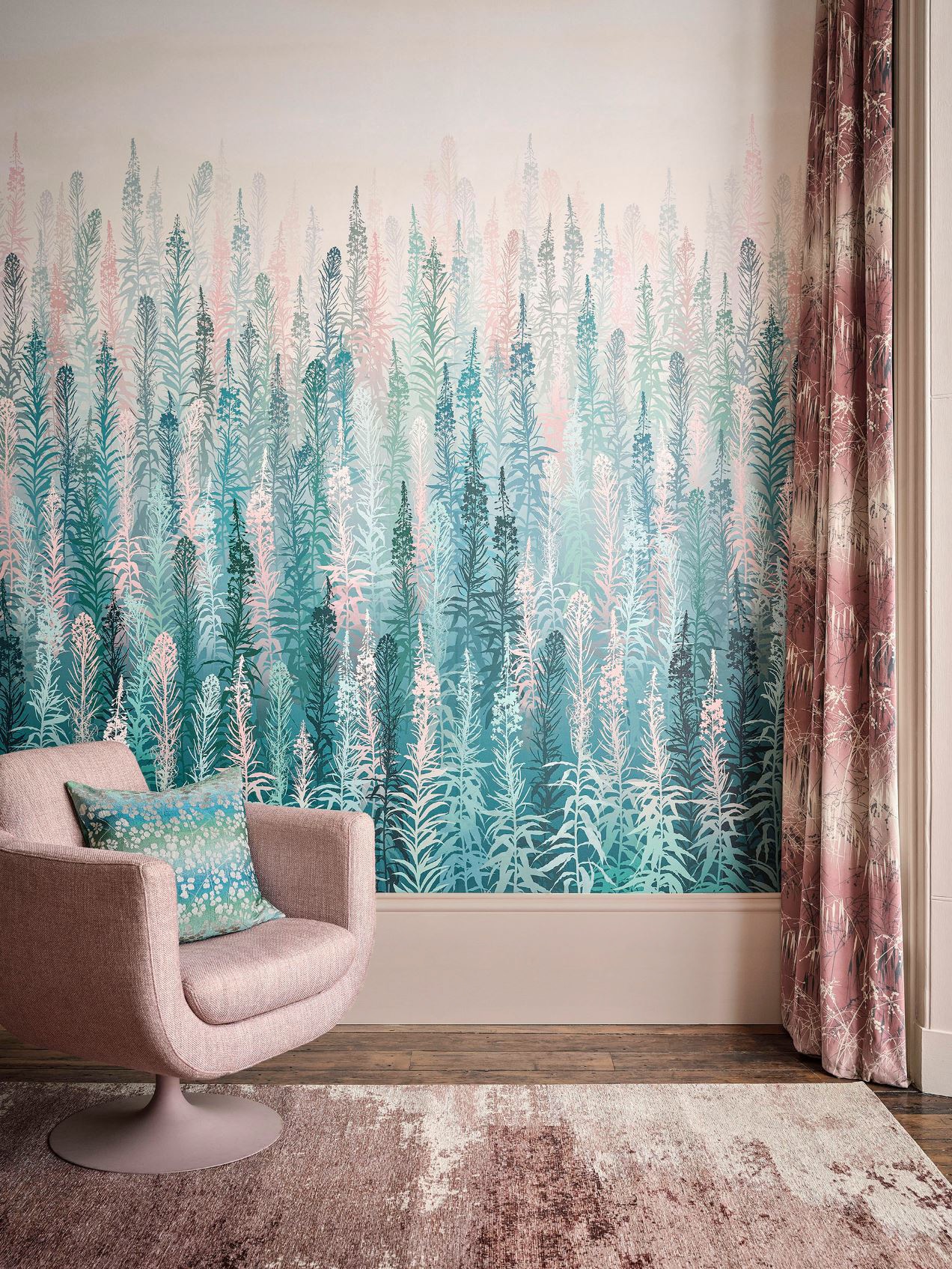
Once you’ve locked in your key pattern choice, and have a rough idea of how you’d like to use it (whether as wallpaper, fabric or both), consider how the hues within its colourway could be picked out to complement (or contrast) against it elsewhere in your room. Opting for a tone that is prevalent in your show-stopper pattern will create a more harmonious look, but if you’re keen to achieve a a little more drama, consider picking out an accent colour (aka a tone which is only used in details across the overall pattern) and use that as your key hue across walls or furniture pieces. This will ensure the design still blends together as a whole, but in a less obvious way.
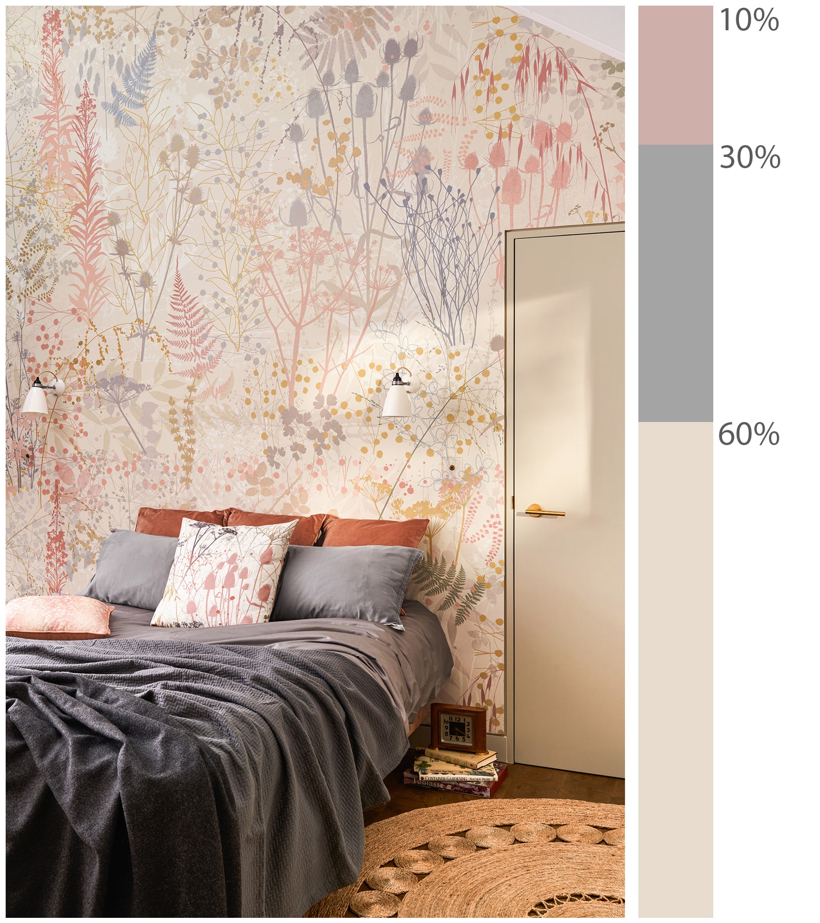
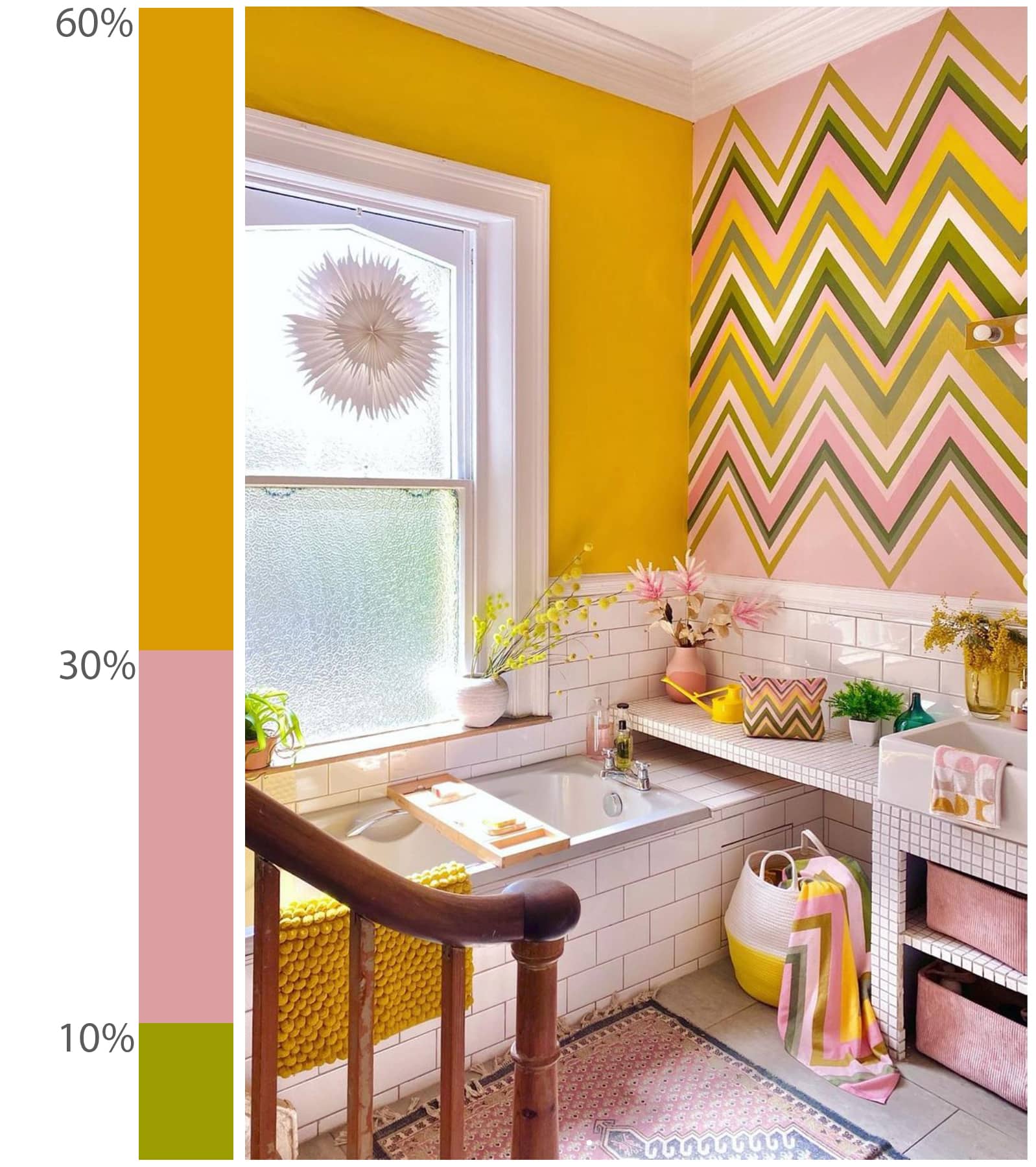
Many design ‘rules’ relate simply to balance and ratios, and one that’s worth keeping in mind as a guide is the 60/30/10 principle. Commonly applied to colour ratios used in an interiors scheme (or within a pattern itself), these proportions are read as pleasingly harmonious to our eyes.
I only came across this rule relatively recently- but realise it is something I often do intuitively when designing anyway. (CH) To apply it in practice, think of your overall scheme as comprising of 60% your leading or ‘dominant’ colour (regardless of whether this is a bold or neutral tone), 30% acting as a secondary colour, then 10% as an accent. This methodology can be applied quite literally to three specific shades (i.e emerald, duck egg and coral), or more broadly as colour families (3 shades of green).
If you’re after a more eclectic style with a broader range of tones and contrasts, consider the overall ‘volume’ of your scheme, too. So if, for example, you’re installing a wallpapered feature wall or supersized artwork, and plan to paint the surrounding walls and woodwork to tie in with its key colours, mirroring its dominant, secondary and accent colours in your paint choices will create a more tonal effect overall, whereas flipping this around – and using the wallpaper’s accent tone as your dominant paint colour – will add a little more drama.
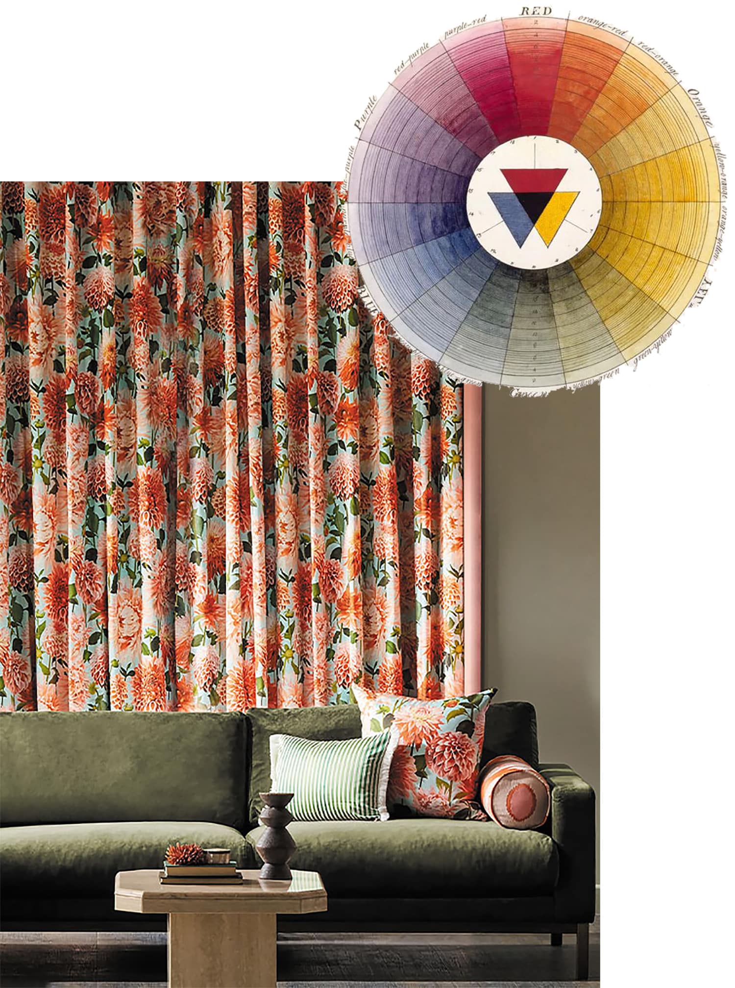
You needn’t limit yourself to only choosing colours directly from your key pattern, however, especially if that pattern consists of only a few tones and you’re keen to create a multi-hued look. You could pick one hue from your palette, and for a contrast introduce a colour that sits on the opposite side of the colour wheel – which in coral pink’s case would be olive green – to give a considered pop.
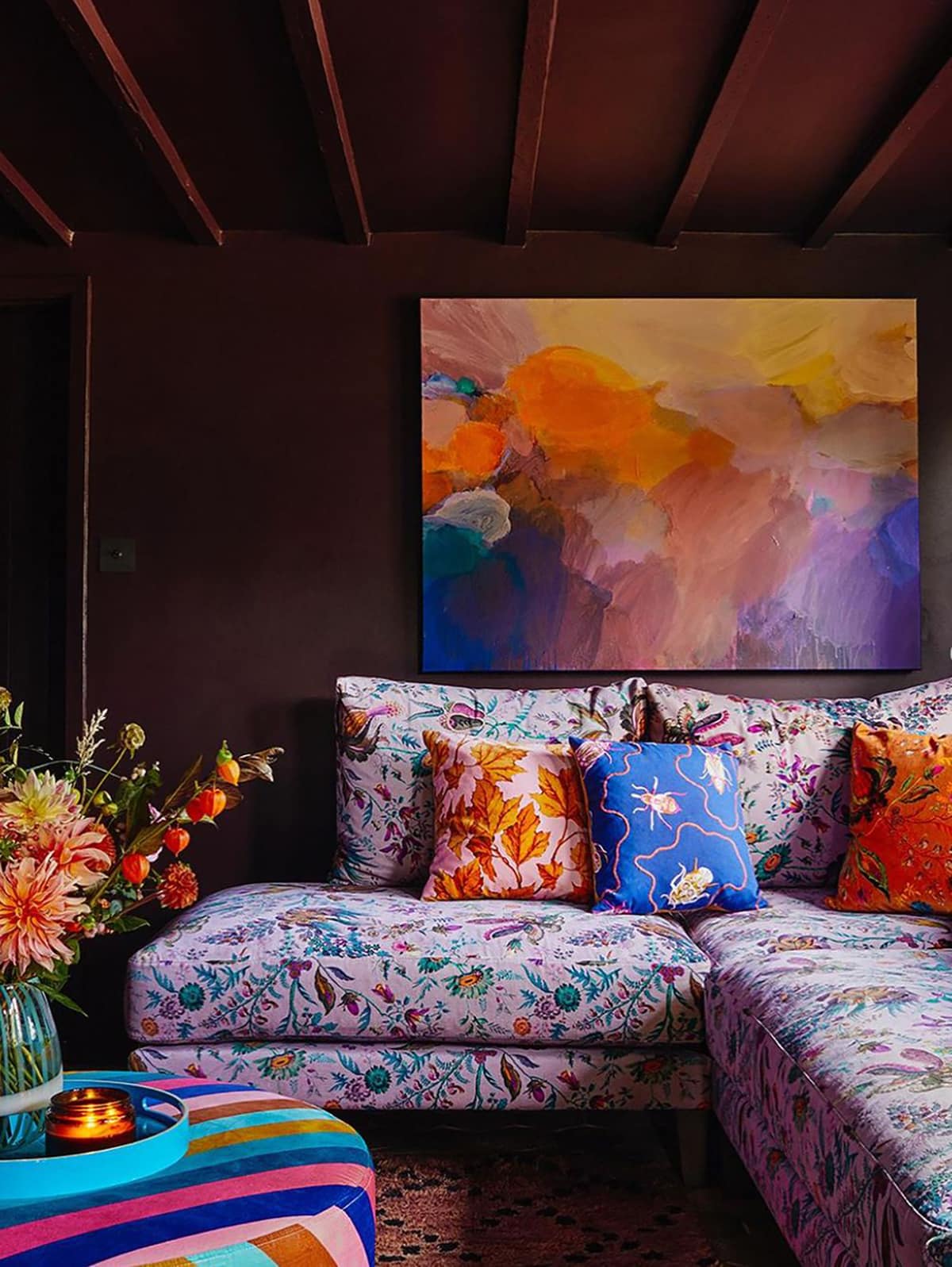
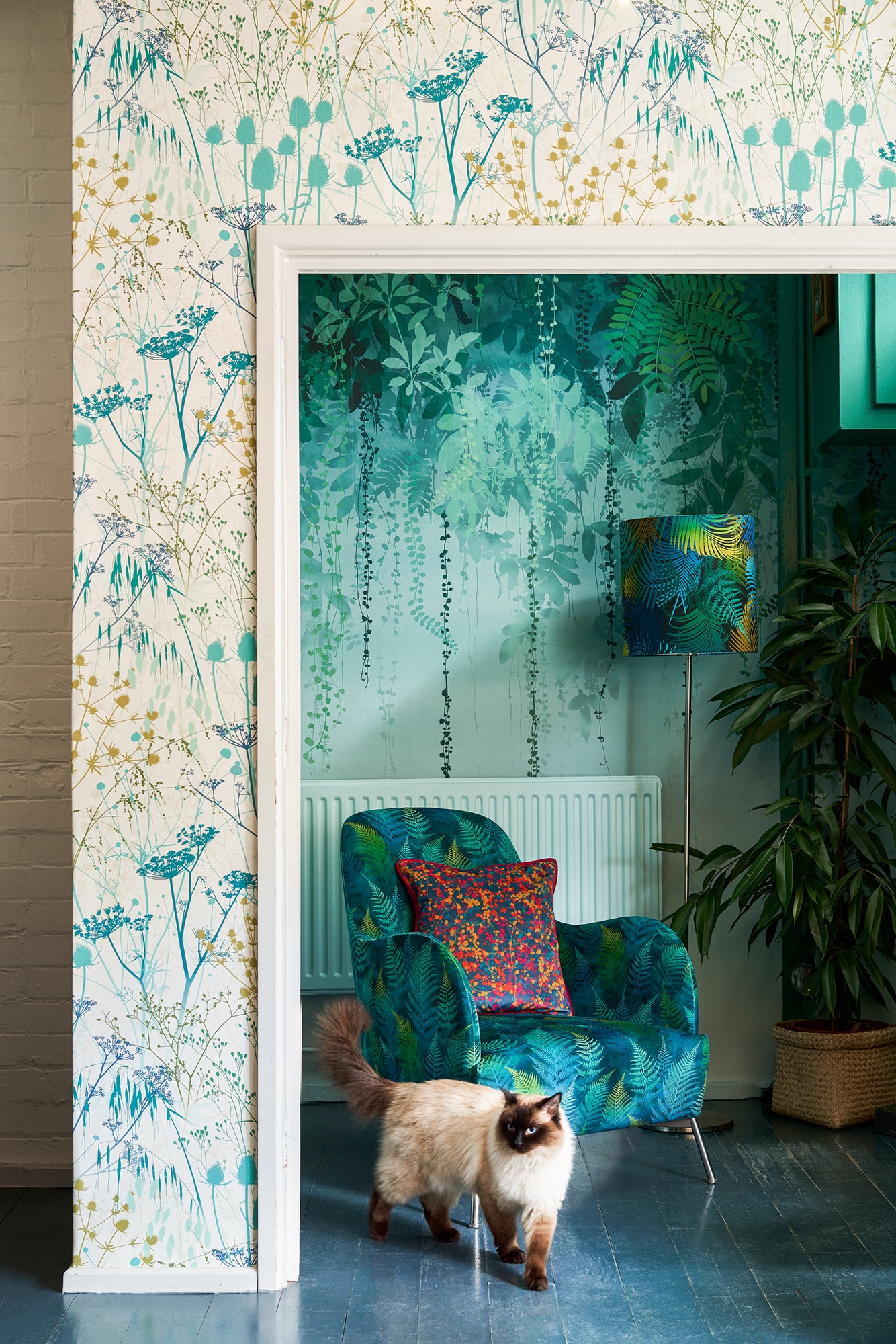
Chances are you’ll have more than one pattern within your overall scheme, even if some are subtle accents rather than contrasting designs. The approach to choosing your colour scheme broadly remains the same, however: get clear on what print is going to form your ‘hero’ design, then ensure any other patterns complement this, or contrast it in a complimentary way.
Even if you’re keen to create a clashing, maximalist look, try to ensure your additional patterns still share a colour or pattern-based relationship with your key design, and aren’t fighting each other for the limelight, to help avoid overwhelm however busy your desired end result may be.