A colourful dream job with Marianne Shillingford

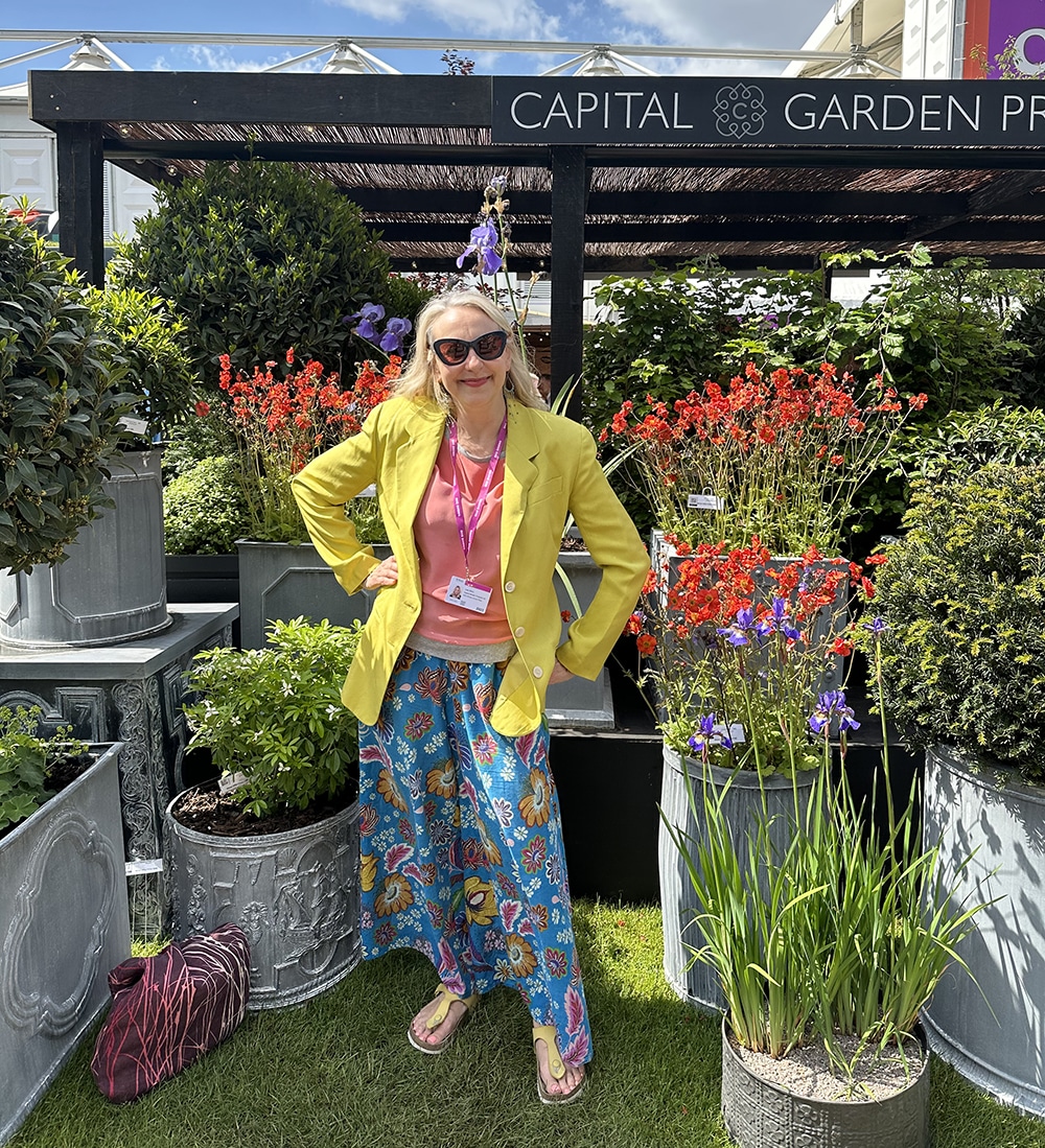
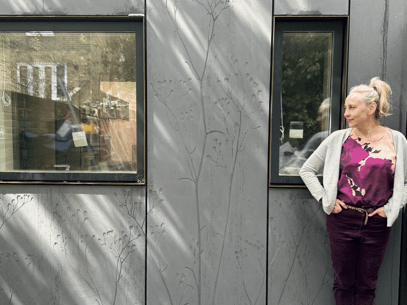
This week I would like to introduce you to someone I really admire and who certainly knows a thing or two about colour. Marianne Shillingford has, as far as I am concerned, the job of dreams. As the creative director at Dulux, she seems to spend her days playing around with colour samples and advising famous people on their decorating schemes.
Marianne has set up the brilliant Colour in Design Award to help design graduates get a leg up in this highly competitive industry, and I am so deeply honoured to be one of the judges on the panel. Getting to see the next generation’s innovations is the highlight of my year!
Hello Marianne...
What is your earliest colour memory?
My earliest colour memory is being surrounded by acres of perfumed colour because my dad was a rose grower and we were bought up in the heart of a 60 acre garden bursting with scented petals in every shade imaginable.

What’s the colour on your front door and why?
This year it’s Wild Wonder our Dulux Colour of the Year for 2023, last year it was Bright Skies our Colour of the Year for 2022. You get it…every year, I paint my front door in the latest Colour of the Year. All the neighbours wait with bated breath to see what it might be and I get to see a first hand reaction to it from people who don’t tend to hold back on an opinion.
CH: This is brilliant. I’d love to hear the comments on the street!

I think that being creative director at Dulux sounds like my actual dream job! Is it as good as it sounds and how did you get there?
It is indeed the dream job and I am very privileged to have it. There is never a day that passes, where I don’t pinch myself and thank the Gods of colour for my good fortune. It would take a Netflix mini series to tell the whole story of how I got here but my career has always been rooted in colour, craftsmanship and paint. I studied art, learnt how to sign write (because I wasn’t very good at fine art and wanted to earn some money doing the thing I loved), through serendipity landed a life-changing job with Pete Tate one of the leading Showman’s decorators in the UK and painted fairground rides for a few years before starting my own decorating and design business. While bringing up 3 children and earning a crust painting and making, I had the chance to do a bit of telly, show off at design events and write a lot of articles for magazines about colour and interior decorating. I have always used Dulux paints, because the colours were so good and the paint never let you down. It must have been spotted by someone at colour HQ and I was invited to tour the UK showing decorators how to use one of their revolutionary new products that had proved so successful for me in my own business. It was such fun and the company were so amazing to work with, I snapped up the chance to work with them again at any opportunity. And here we are, years later…I have the job everyone wants in a company I truly believe in. I’m a now proper grown up and still living my best life in full colour.
CH: What a wonderful and inspiring story! I think we should commission Netflix, it would be a gripping mini-series that I would be glued to.


What inspired you to found the Colour in Design Award, and how did you go about it?
The launch of the Colour in Design Awards was inspired by my dear old dad who left me a bit of money when he died. It was enough to buy something decent that would make life better and so am spending it doing just that. Dad put food on our table and a roof over our heads with living colour. I have done it for my own family with colour in paint. I know others can do it for themselves, their families and the wider world with many other creative mediums from fashion and textiles to furniture and product design. Making life a bit better for new designers who use colour in the most inspirational ways is what the awards are all about. It’s pretty simple really. A joyful no-brainer award in a design language that all creatives speak, can take part in and celebrate together.


If you were creating a colour called Marianne, what would it be?
A colour called Marianne…hmmm. It’s definitely orange – but not just one shade of orange. Sometimes this orange is neon, sometimes it’s intense and organic and sometimes it’s rich, dark and caramelised. Orange for me is the colour of creativity, harvest, warmth, nurture and home.
CH: Oh I am 100% with you on the colour orange. In fact both Rose and I (she works on designs with me) are both obsessed with it and have to sense check all our designs to make sure they aren’t too orange heavy!

Tell me your most memorable work moments?
Crikey. There are so many moments. Maybe even one memorable moment every day. But that’s a rubbish answer…so I’m going to be more specific and honest. The best moments in my work and personal life have always been the moments that happened after I said ‘yes’ to something I wanted to do – but had absolutely no idea how to do it. ‘Work it out kiddo’ was my dads sage advice on anything I wanted him to do for me – that he knew I was perfectly capable of doing myself. Anything from drilling holes and using a lathe to reading instructions properly and seeking help and advice from experts. It taught me how to learn – and it has proved to be a super power for a woman who isn’t conventionally clever or educationally accomplished. I wanted to earn a living using a paintbrush and colour so I took myself off to college and learnt traditional signwriting and decorating skills. It led to an amazing few years painting fairground rides and sculpting carousel animals. Learning how to do practical things professionally opened the door to the commerce of creativity and I could with confidence put a monetary value on my time and skills. I studied and practiced how to communicate more effectively which led to writing about and presenting the thing I loved to wider audiences and I got to do a bit of TV as a designer and presenter as a result. Maybe one of the most unusual and challenging creative high points was saying yes to designing and overseeing the installation of a beautiful living floral carpet that covered Trafalgar Square. Being asked to be the Creative Director of Dulux is up there too and launching The Colour in Design Awards continues to deliver high points year on year. Everything life throws at you is an opportunity to learn a new skill and something new about yourself – you must never stop learning.
Is there anything really exciting you in interiors at the moment?
I’m thrilled about the fact that design and creativity is focused on making life better rather than just more beautiful in interiors. It’s the deep thoughtfulness about process and manufacturing, the emphasis on hand made, the use of waste materials and the consideration of the lifecycle of everything. I’m in awe of this next generation of creatives who are rising to the scariest of challenges and helping make home a place we can get everything we want and need – a comfortable, nurturing place, self sustaining place that will last long into the future.

Do you have any go-to colours for decorating?
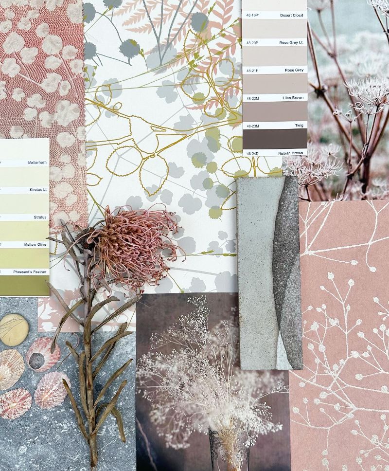
The natural landscape always inspires my go to colours for decorating. I start with the neutral shades of raw materials like wood, stone and clay and use them as bedrock colours then add richer verdant shades from the mountains, meadows, sea and sky. It’s the flora and fauna like flowers, tropical fish, birds and insects that provide inspiration for the visual cherries on the cake. These are natures brights that I dial up and down for dramatic effect to enhance that way I want to feel and are usually contrasting in colour and tone to the main wall colours.

Do you ever get colours wrong?
I change my mind about colour all the time and yes I do get colours wrong. The biggest mistake is not to try out a sample or mix a bit up first to see how it’s going to dry and look in different light conditions. I once painted my whole flat in a linen colour that looked violet in the daylight. It wasn’t what I had imagined and couldn’t stand it so I painted it out within a week. Colour is subjective – it’s personal! I try hard not to be influenced by my natural likes and dislikes when choosing palettes. Collections of colour should tell a story about a time, place and feeling you want to evoke. It’s in the storytelling where you can step into brand new shoes and walk for miles and miles without a single blister.
It’s quite amazing how different colours look on different walls in the same room. I have literally just put down a paintbrush in my ‘soon to be’ bedroom, painting patches on the walls. It’s a beautiful soft green on one wall and a nasty pale yellow on another!
What’s on your wish list from my shop?
I want to be wrapped in your colours and show them off to the world so it would have to be one of your scarves. The Acacia Tree design in hot pink. Flippin gorgeous.

This conversation left me feeling so inspired – thank you to Marianne for giving such lovely answers. It’s left me thinking, what colour do you think your name would be? I am a coral pinkish colour (at the moment!)