20 Mar
An unusual colour couple


This week’s blogpost comes from my bed as I have finally succumbed to Covid! Having had so many close shaves over the past year I was beginning to feel rather invincible. But the adage of ‘Pride comes before a fall’ is now ringing in my ears. Stanley and Lulu have been keeping me company snuggled up beside me.
From my sick bed, I’ve been scrolling through my photos and SO many of them have colour as their central theme. It is a distant pipe dream of mine to one day create a beautiful book on the subject.
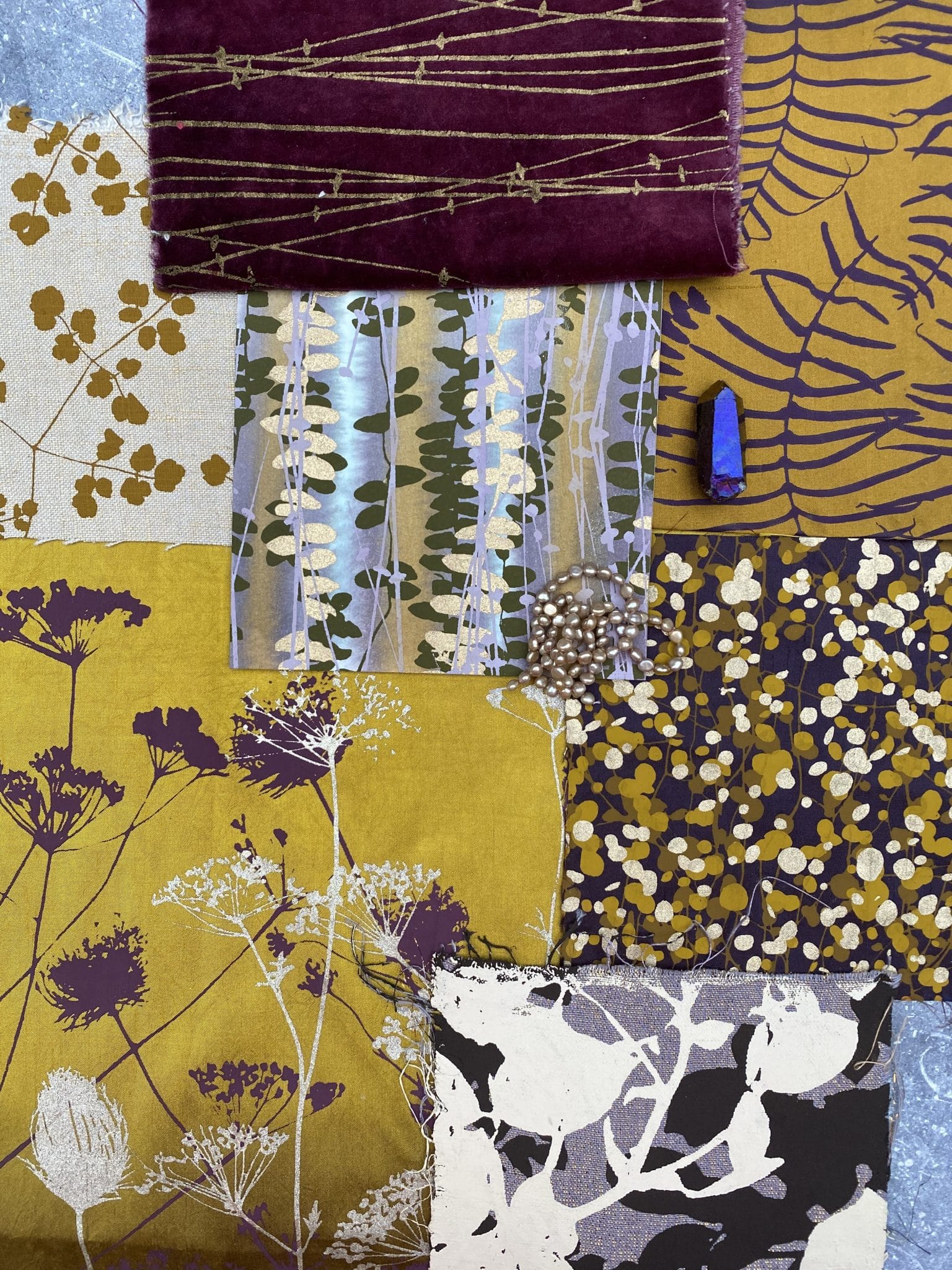
But in the mean time, I thought I could talk about colours in new series called Colour Couples. First up is purple and yellow, aubergine and turmeric, iris and saffron…
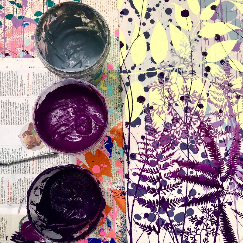
I LOVE combinations of colours that are opposites on the colour wheel. Purple and yellow are of course complimentary, which in theory means they show each other off to the best advantage. But I find when used in a saturated hue there is an interesting tension between them, which can feel quite edgy.
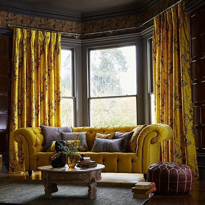
When it comes to decorating, texture and sheen can completely change how this colour couple feels. On silk, the two colours create a really exciting balance. The rich yellow of the Burnet silk below is all warmth and optimism, while the purple seedheads give the design depth.
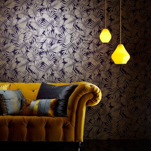
I flipped the colour combination on its head for the Espinillo wallpaper. This design, with its shimmery metallic acacia leaves has a much more contemporary feel.
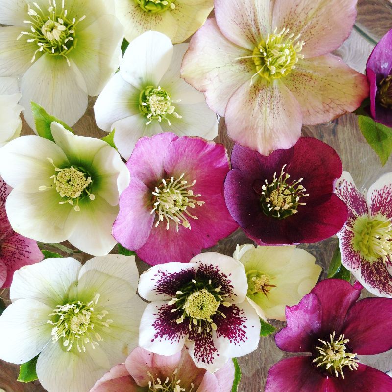
I’ve enjoyed looking for this unusual combination of colours while snapping away at flowers. Just look at the delicate purple petals in the centre of this buttery dahlia, or the acid yellow pop against the mulberry-tinted hellebores below.
I hope you enjoyed this first Colour Couples mailer. Do let me know what unusual colour combinations you love…