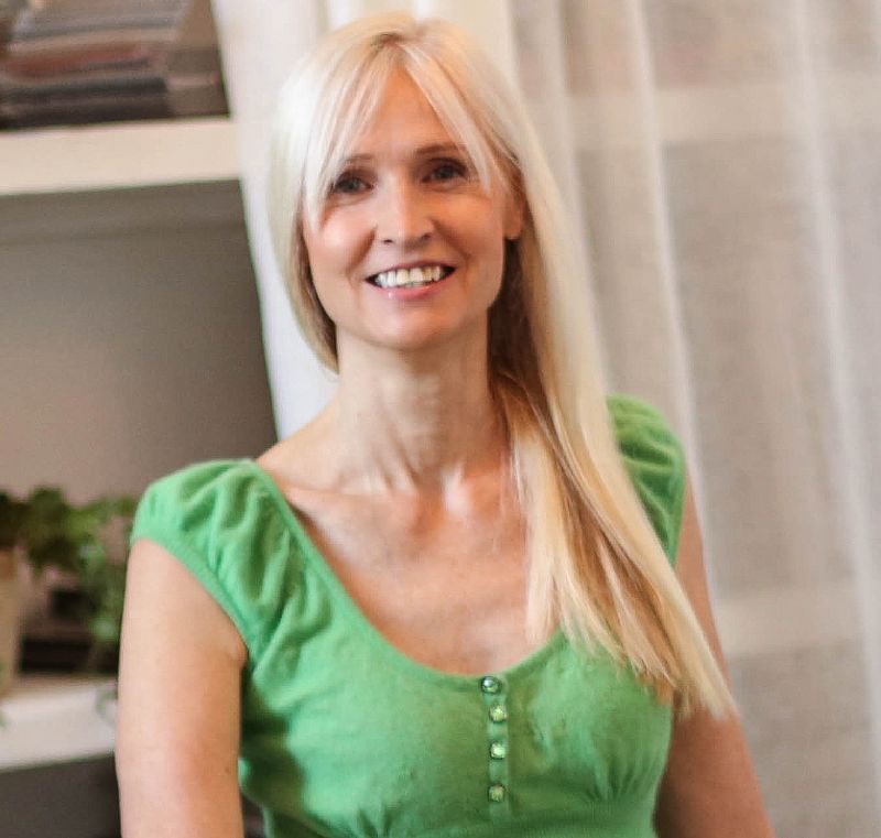
A colourful catch up with Karen Haller

This week I want to introduce you to Aussie ray of sunshine Karen Haller. Her expertise combines 2 of my favourite subjects… behavioural design & colour psychology. A few weeks ago I was interviewed by her for her ‘colour couch’ and it got me thinking that it might be fun for me to have some interesting guest interviews for my blog page too. Topical ones of course…
Karen is the author of this wonderful little book which you may have seen The little Book of colour.
Knock knock. What colour would I find on your front door?
Living in a rental property I don’t have the opportunity to paint the door the colour I want, so it will just have to stay white. But if I could, I would make it a beautiful sunshine yellow so that when my family and friends walked to my front door, they would know they are welcomed, as they were already being greeted with a cheery ‘hello!’.
When did colour become your calling?
I think subconsciously colour has always been my calling, I just didn’t realise it. It was when I was doing my millinery course in my twenties, and I was putting chocolate brown feathers on my duck egg blue felt hat, that I had my ‘Oh my God, it’s colour’ moment. If I look back, that was my epiphany moment when I realised colour was my calling.

You’ve specialised in a field called ‘applied colour & design psychology’ and written a book about it. Can colour really change how you feel?
Yes, and it can also change how you think and behave – in an instant.
That’s because when it comes to colour psychology, colour is emotion. We are having an emotional response to the colours around us. For example, some of the positive psychological traits of red are: it’s energising and get-up-and-go. It’s not a colour that’s asking us to relax. It’s motivating and has an ‘I can do’ attitude!
Change the colour and you can quickly change your state – really! We can use colour to influence positive behaviour and to connect to how we are feeling or how we want to feel, and how others respond to us – this is what I find really fascinating about colour.

What’s the difference between wearing a colour and living with a colour in your house?
Our homes are an expression of our personalities. So the colours that suit us, our authentic personality, we can continue that within our home because it’s an expression of us.
For example, I love the colour orange because it’s fun and joyful. I love its playful energy and it suits my personality. But interestingly, I find the colour too intense to wear. So I wear a softer spring version of orange which is apricot. Then in my home, I have the saturated orange in a lampshade, flowers and bowls in the kitchen. I don’t find it so intense as I can look at it from a distance.
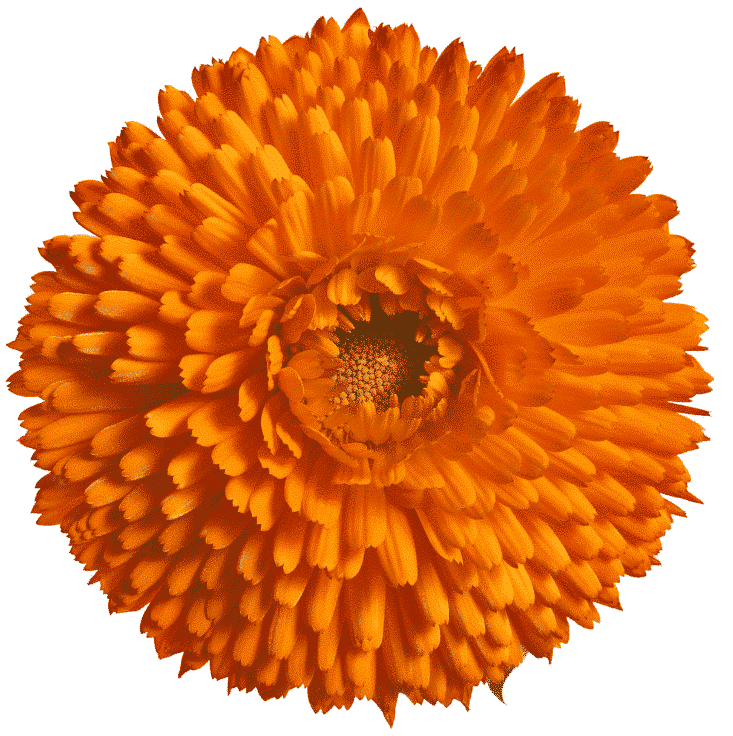
If a paint company was creating a colour called Karen Haller, what would it be?
I think there’s no prize for guessing what that would be – orange. It would be the orange of a Marigold (Calendula) flower, the really bright, clear, joyful, fun orange – that would be my colour.
What colour combinations do you go back to again and again?
My colour combinations actually change depending on how I’m feeling. Thinking about it right now, I’m loving the combination of orange and green which has been swirling in my mind to use for my living room. I’ve loved soft pink, apricot, and gold for a while now and I’m thinking of this combination for my bedroom.
What are your tips about introducing colour into your home if you are a bit scared of it?
All of us are colourful, even the most quiet and subtle of us. If you love soft, muted colours, great. If you want to dial up the colour saturation, then I recommend doing this slowly, little by little so that you can get a sense of when you have it feeling right for you. Quite often what we’re scared of is expressing ourselves or we’re scared of what others might say.

But it’s not their home. It’s yours, so why not have a home that you love and loves you back, whether that’s coloured patterns everywhere, or very subtle and soothing, dramatic or anything in between.

If you were only allowed to wear one colour for the rest of your life, what would it be?
I really don’t know how to answer this question. I don’t think I could live in one colour because that’s like asking me to live in one emotion and I couldn’t do that.
But I do enjoy wearing yellow, it was my lockdown colour, bringing me cheeriness and a big happy smile. But I couldn’t wear it from head to toe because I would start to feel irritated and overwhelmed. Often just a splash of a colour is enough especially when it’s bright and high energy.
So instead I’m going to pick the colour ‘rainbow’ because it’s so important for me to be able to wear the colours that express how I’m feeling, or how I want to feel, or how I want other people to interact with me. I think I may have just spoilt your question!

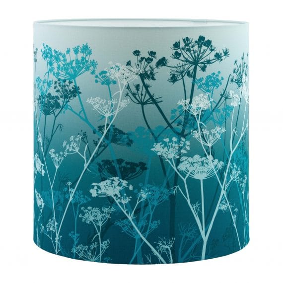
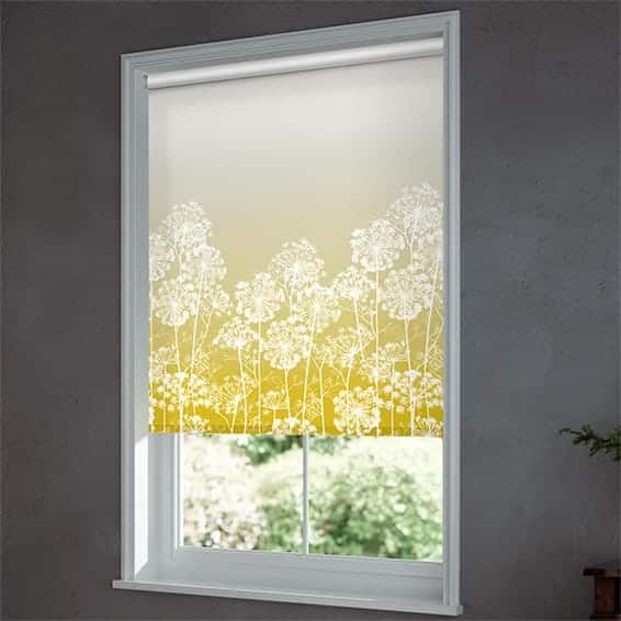
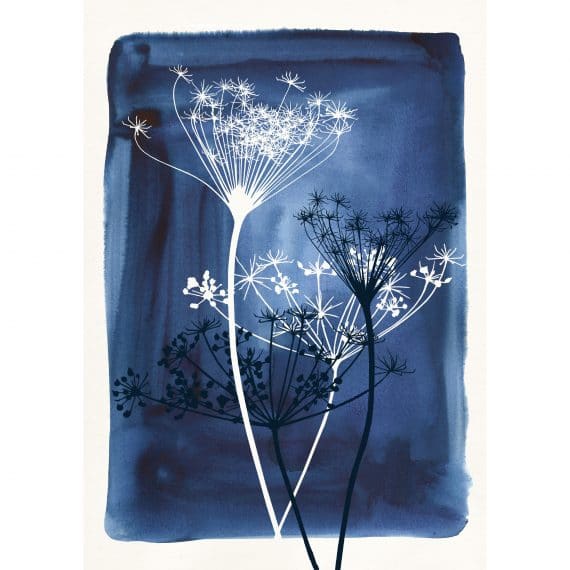
I adore ombre, what do you think that says about me?
Ombre is beautiful. I love how it gently moves through the different saturations of the same colour.
It’s like a musical note that starts off softly, lightly and then increases to a deep, rich crescendo. It’s really quite beautiful as if it’s taking you through the full range of the emotions for that colour.

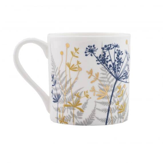
What’s on your wish list from my shop?
I remember when I was in your shop, and we were doing the interview for my colour trends course, and I was saying to you how much I love your cow parsley design. I love how delicate and light it is as if it’s moving in the breeze. I just now need to convince you to do one in spring colours just for me!
I loved diving into the mind of a total colour obsessive and hope you did too!

Bits and buds
🌸 If you’re a design professional, you might like to download Karen’s free e-book about the 10 myths that limit you using colour effectively
🌸 Dried flowers take centre stage in the beautiful Berlin home
🌸 Comedy and sketches from Olga Thompson, aka Big fat Greek Mother